In the world of geospatial analysis, we often focus on the power of our tools to process vast amounts of data. But what happens after the analysis is done? The most profound insights are useless if they cannot be communicated effectively. My time at the Esri Romania User Conference was a powerful reminder that our role is evolving from pure analysts to data storytellers.
A simple map shows data. A geospatial story persuades, clarifies, and drives action. This post explores the techniques and technologies that are helping us move beyond the static map.
Why a Simple Map Is No Longer Enough
Traditional thematic maps are excellent for showing distributions, but they often lack narrative and context.
Geospatial storytelling is the methodology of building a narrative using a sequence of maps and visualizations to guide an audience through an analysis or presentation. Instead of just presenting a result, you are telling the story of how you got there, making the conclusion more impactful and understandable.
Tools and Techniques for a Deeper Narrative
The modern GIS platform offers a powerful toolkit for crafting these data-driven narratives. Here are a few of the key techniques that are becoming standard practice:
- Advanced 2D Cartography: We can now move beyond simple color-coded maps. Techniques like cartograms distort geography to represent a specific variable, instantly showing where the weight of a phenomenon lies. For analyzing hot spots, using hexagonal grids to aggregate data provides a visually cleaner and more accurate representation of density than traditional administrative boundaries.
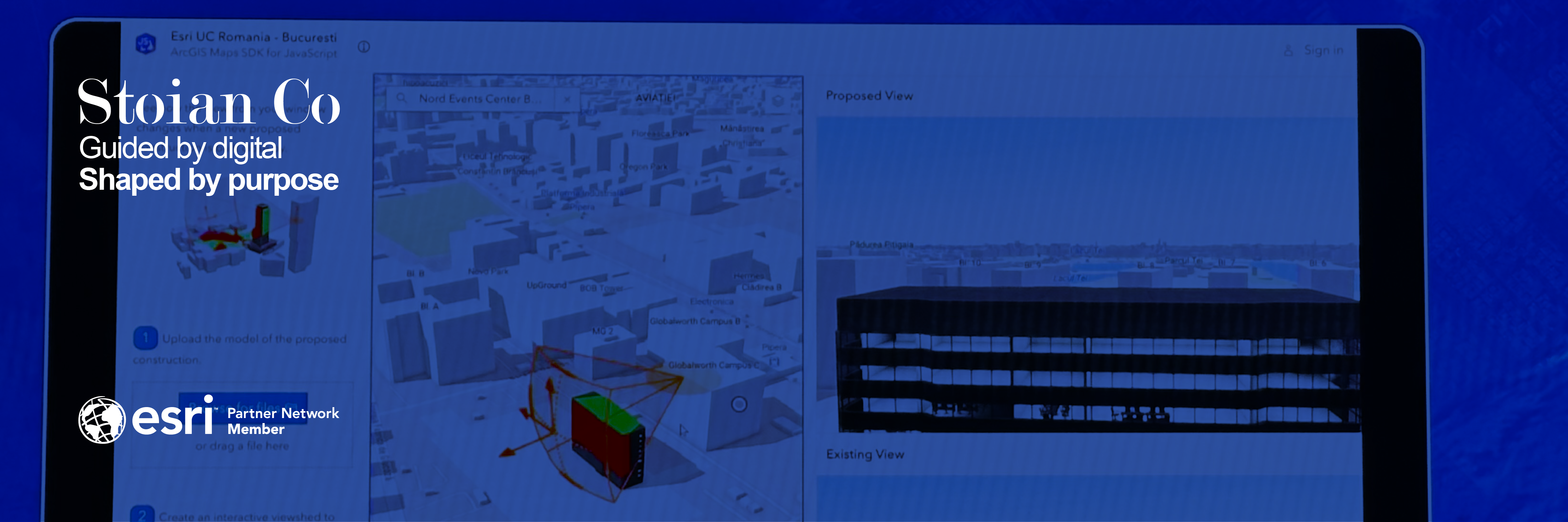
- The Rise of 3D: The wall between 2D and 3D GIS has crumbled. Today, it is a unified environment where we can switch perspectives to gain context. This is not just for aesthetics; it has critical, real-world applications. Shadow analysis, for example, is used in urban planning to ensure new developments comply with regulations on sunlight access for neighboring properties. Similarly, viewshed analysis can simulate the visual impact of a new building from any vantage point, a crucial tool for developers and city planners.
- Interactive Dashboards: This is the new standard for data communication. A dashboard that integrates dynamic maps with interactive charts and graphs allows users to explore the data for themselves. Selecting a category in a chart can instantly filter the map, and vice-versa, creating an intuitive and engaging experience that empowers decision-makers.
Turning Data into Decisions
What is the ultimate goal of these advanced techniques? To close the gap between data and decision. A compelling visual story is far more persuasive than a table of numbers. It helps stakeholders understand the nuances of a problem and builds consensus around a solution.
At Stoian Co., we believe that effective communication is the final, crucial step of any analysis. We help our clients craft these narratives by:
- Designing and building custom interactive dashboards that answer key business questions.
- Performing 3D impact assessments for urban development projects to support planning and regulatory approval.
- Creating data-driven presentations that turn complex spatial analysis into clear, persuasive stories for investors, regulators, and the public.
The best analysis deserves the best delivery. In a world saturated with information, the ability to tell a clear and compelling story with your data is what sets you apart.
If you are ready to turn your data into your most powerful communication asset, let’s talk.